

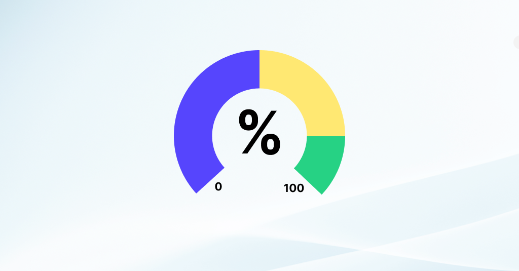
What is a Gauge Chart?
A Gauge Chart, also known as a dial chart or speedometer chart, is a type of data visualization tool used to display a single value within a specified range, often in comparison to one or more target values. The chart resembles the face of a gauge or dial, with a pointer or needle indicating the value being measured relative to the range or target values.
Key Components of a Gauge Chart
Value Axis: The Gauge chart axis represents the range of values being measured, typically displayed in intervals or segments along the circumference of the gauge. The scale may be linear or nonlinear, depending on the data being visualized.
Needle or Pointer: The needle or pointer extends from the center of the gauge to indicate the current value being measured. It moves along the axis based on the value being displayed, providing a visual indication of where the value falls within the range.
Target Value(s): Target values, such as goals, thresholds, or benchmarks, may be displayed on the gauge as reference points. These targets help users interpret the current value concerning desired outcomes or predefined standards.
Labels and Annotations: Gauge Chart labels and annotations provide additional context and information about the data being displayed. They may include units of measurement, titles, descriptions, or other relevant details to aid interpretation.
Gauge Chart Benefits and Usage
Gauge charts are commonly used in various domains to visualize metrics, KPIs (Key Performance Indicators), and other performance-related data. They are particularly effective for displaying single values or progress towards a goal in a visually intuitive manner.
Examples of Applications for Gauge Charts
- Monitoring progress towards sales targets or revenue goals.
- Displaying performance indicators for financial metrics like profitability or return on investment.
- Tracking progress towards project milestones or completion percentages.
Conclusion
Gauge charts are highly-effective, however care should be taken to ensure that the scale and design of the chart effectively convey the intended message and facilitate accurate interpretation by users.