What is a Pareto Chart?
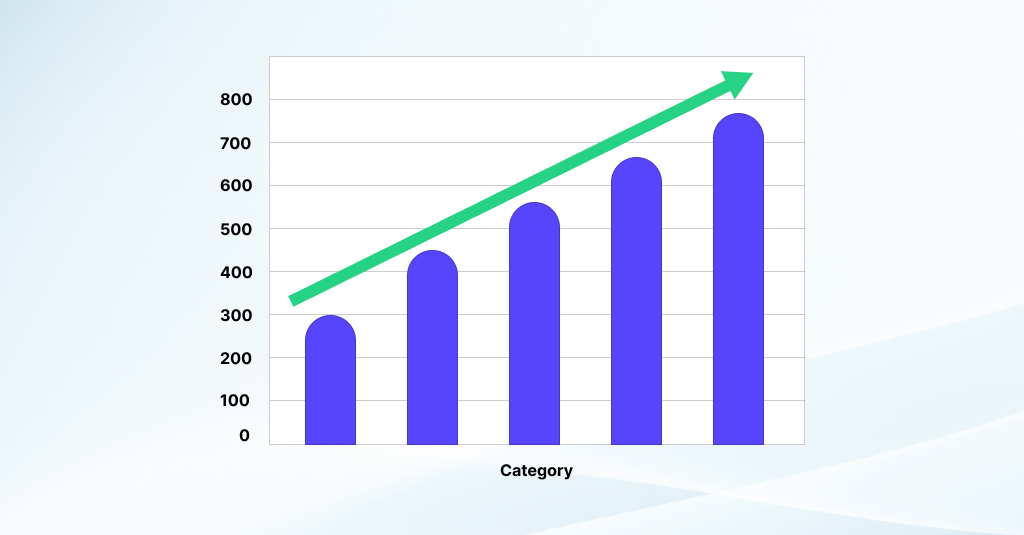
A Pareto chart is a visual representation of data that helps identify and prioritize the most significant factors contributing to a particular issue or outcome. It combines both bar and line graphs to highlight the relative importance of different categories. The bars represent individual categories or factors, arranged in descending order of frequency, occurrence, or impact. Meanwhile, the line graph displays the cumulative total of those categories, emphasizing the cumulative impact as each category is added.

Pareto Chart Overview and Usage
Derived from the Pareto principle, which states that roughly 80% of effects come from 20% of causes, the Pareto chart aims to pinpoint the vital few from the trivial many. This principle suggests that focusing on addressing the most significant factors can lead to substantial improvements.
Commonly used in quality management, process improvement, and decision-making contexts, Pareto charts enable stakeholders to visualize and understand where resources and efforts should be concentrated for maximum impact. By identifying and addressing the key contributors to a problem or outcome, organizations can prioritize actions that yield the greatest overall improvement. Thus, Pareto charts serve as valuable tools for efficiently allocating resources and guiding decision-making processes
Benefits of Pareto Charts
Visual Clarity: Pareto charts provide a clear visual representation of data, making it easier for stakeholders to understand the relative importance of different factors or categories at a glance.
Prioritization: By organizing categories in descending order of frequency or impact, Pareto charts help prioritize issues or areas for improvement. This enables organizations to focus their resources and efforts on addressing the most significant contributors to a problem.
Identification of Key Factors: The Pareto chart highlight the “vital few” from the “trivial many” based on the Pareto principle. This allows stakeholders to quickly identify the factors that have the greatest influence on outcomes or performance.
Resource Allocation: With Pareto charts, organizations can allocate resources more efficiently by directing them towards the most critical areas. This ensures that efforts are targeted where they can make the most significant impact, maximizing the return on investment.
Data-Driven Decision Making: Pareto charts facilitate data-driven decision-making by providing empirical evidence of which factors are most influential. This reduces reliance on intuition or guesswork and enables informed decisions based on objective analysis.
Continuous Improvement: By regularly updating and analyzing the Pareto chart, organizations can track progress over time and identify emerging trends or areas that require ongoing attention. This supports a culture of continuous improvement and helps drive organizational effectiveness.
Communication: Pareto charts serve as effective communication tools, enabling stakeholders to convey complex information in a straightforward and easily understandable format. This fosters collaboration and alignment among team members and decision-makers.
Conclusion
Pareto charts offer a systematic approach to analyzing and addressing issues, driving efficiency, and supporting informed decision-making within organizations.


